Want a New Look for Your Portraits? Think Back-to-Front
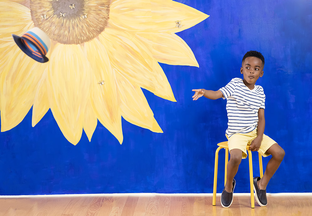
Aubri fitting as planned into the sunflower painting. The children's clothing was a mix of items Tamara bought and those she suggested the parents bring. "The sun hat works with the 'I'm in a field with sunflowers on a sunny day' feel of the photo," she says. D850, AF-S NIKKOR 105mm f/1.4E ED, 1/500 second, f/4, ISO 1000, manual exposure, spot metering.
Let's talk about backgrounds
Not the distracting kind—the ones we're all taught to avoid. In the great outdoors we're cautioned first to observe—to check the background to be sure there's nothing confusing going on back there that will draw attention from our subject—and then to eliminate unwanted elements by moving or zooming or swapping lenses or crouching a bit to make the sky the background.
Shooting in a studio we opt for the clean, the dramatic or the neutral: white seamless, black velvet or readymade washes of color straight from French Impressionists.
All well and good, but...
What about creating a compelling, intriguing, even fanciful background, subtle or bold, that complements and directs attention to the subject. Maybe a background into which the subject perfectly fits—because that was the plan from the start. A background that gives the subject the opportunity to project personality. Perhaps even a storytelling background.
Backgrounds like that can change the game for you by offering a new set of tools—not cameras or lenses, but ideas for graphic elements that generate interest and energy and participation.
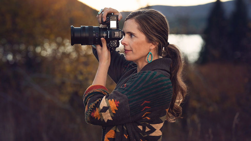
That's what Nikon Ambassador Tamara Lackey created when we offered her an assignment to shoot end-result D850 images for display and promotion. We knew she'd shoot portraits of children—it's a specialty—but what surprised and delighted us was what she added to the images.
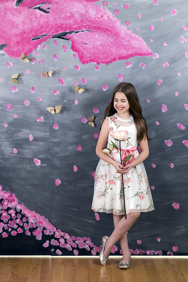
Positioning and expression were crucial factors in this photo of Eva and the cherry-blossom background. The positioning was planned; the expression was the result of Eva's personality and Tamara's enthusiasm and charm. D850, AF-S NIKKOR 105mm f/1.4E ED, 1/640 second, f/5, ISO 1000, manual exposure, Matrix metering.
This image of Aubri is one of Tamara's classic looks for her photos of children. "It's a reference to my usual style," she says, "and it also shows off the type of stunning images the D850 produces." D850, AF-S NIKKOR 105mm f/1.4E ED, 1/2000 second, f/1.6, ISO 800, manual exposure, Matrix metering.
Planning Ahead
"This was kind of a dream assignment for me," Tamara says. "The concept was to come up with something creative in child photography to show off the capabilities of the D850, and I had the idea of creating my own backgrounds for the photographs, something a little more interesting than traditional backgrounds. It was an assignment, but because of the freedom I had, it felt from the start like a personal project."
Tamara's first steps were weeks of sketching ideas using an app on her iPad. Then she contacted a local-area artist she knew by reputation, and the two went back and forth on design elements and colors.
The structure for the artwork was two 4x8-foot plywood panels joined by brackets to form an 8x8 surface for four paintings—two for the front, two for the back. "We used white chalk paint to start with so we'd have a really clean surface for the paintings," Tamara says.
The paintings allowed for the spaces into which the models, who were cast ahead of time, would be placed or jump into. Tamara got the heights of all the models so she'd know how much space to allow for them in the artwork.
Tamara's concept included elements in the background that would tie in to the models. "We decided on a series of little butterflies that would appear on the art and the subjects," she says. "The butterflies were kind of a theme—they were either really subtle or really obvious in the pictures. We got them from a craft store and painted them."
"Eva knew exactly where to jump to—to the showcase spot in the painting that allowed for the jump. She did it three of four times, and I remember yelling "So good!" when she got this one." D850, AF-S NIKKOR 24-70mm f/2.8G ED, 1/1250 second, f/5, ISO 2500, manual exposure, Matrix metering.
On Set
Tamara, who is based in Durham, North Carolina, rented a nearby event venue called The Glass Box for the photography. "I could have done the shoot in my studio, but this place has windows everywhere, and I wanted to be able to have a number of looks from natural light blending in with daylight-balanced light."
"We set up the backdrops and the lighting—we had SB-5000s and Westcott Flex Lights, but it was a simple reflector we ended up using for a number of the photos. Then we brought in the children—one of them I'd worked with before, the others we got from a casting call at a model agency. We wanted a variety of looks and personalities, and we were able to achieve that."
The assignment was a chance for Tamara to stretch out creatively. "The way I saw it I was basically able to create from scratch a personal project," she says, "something I envisioned, something I thought really interesting and something I don't do in my everyday client work. It was actually in contrast to normal work where I try to be responsive to what's happening and set some organic directions. In this case it was very much thought out in advance, and the spontaneous and creative part of making it happen was all about getting the expressions and gestures from the children."
Not one of the painted backgrounds, but a thoughtful departure from a traditional backdrop. Tamara photographed Audrey, and the shoot's signature butterflies, with just the edge of a vintage gold screen showing and The Glass Box's windows blurred behind her. D850, AF-S NIKKOR 105mm f/1.4E ED, 1/500 second, f/2.5, ISO 320, manual exposure, spot metering.
Carrying It On
When we asked if the assignment would influence what she might offer her clients going forward, Tamara said, "Absolutely. Incorporating a more creative feel—even just creating a pattern on the background with various lighting—is something I want to do. What this assignment has done for me is answer the question, Does the image in my head actually work as a physical photograph? It does, and every time I do that kind of creativity—in a personal project or something very different in my work—I find that it re-energizes all of my work."
She adds that you don't have to be a professional photographer to make ideas like this work for you. "I loved this shoot," she says. "Part of it was this immense freedom, to create whatever I wanted. What I'd suggest to other people is that when you're doing any sort of personal project, put as much of yourself as you can into it, because that's where it's going to shine."
"Yep, it's all in-camera—Kingston is really tossing the hat. We did it a few times, and I love the Mr. Cool expression he got for us." D850, AF-S NIKKOR 105mm f/1.4E ED, 1/1000 second, f/3.5, ISO 1250, manual exposure, Matrix metering.
BTS - Go behind the scenes with Tamara Lackey on the photoshoot with the painted backgrounds.


