Take Better Portraits
Learn the elements of a good portrait photograph
It can't be that difficult, right? Your friend/spouse/child asks you to take his/her picture. You have a nice digital camera, so you grab it and take the picture. But you're not happy with the result, and you don't know why. It's in focus and properly exposed; so what's wrong? You've just learned that there's more to a good portrait than getting it technically right.
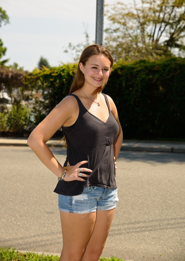
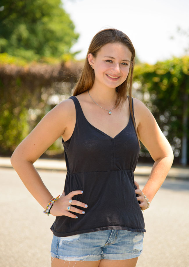
First, put some thought into the background. It shouldn't distract from the subject. A plain wall, dark green foliage—anything that's simple (without strong lines or patterns) works well. There's nothing worse than a line, pole or branch going through or growing out of the subject's head.
D800, AF-S NIKKOR 24-120mm G ED VR lens, 1/250 sec., f/6.3, ISO 100, Shutter Priority, Matrix metering, fill-flash.
In this photo there is a street signpost growing out of our subject’s head.
D800, AF-S NIKKOR 24-120mm G ED VR lens, 1/250 sec., f/4, ISO 100, Shutter Priority, Matrix metering, fill-flash.
In this photo, we’ve moved over just a few feet—no more signpost—and we've produced a more pleasing photograph.
If you photograph someone against a bright background, you may well end up with a silhouette. That's because the brightness can cause the camera to underexpose the subject, making her look dark. You could pop up your Nikon D-SLR's built-in flash or turn on the flash in your COOLPIX or Nikon 1 digital camera to add light to your subject's face, but you'd still have that bright background.
Every Nikon D-SLR and COOLPIX has exposure compensation, so you could overexpose by one or two f/stops or shutter speeds as well. If these methods don't work, then try a different background, preferably something darker than the subject.
Keep in mind that the picture is about your subject. Don't shoot the entire area around them. Get closer by physically moving in or by using a telephoto or telephoto zoom lens. Isolate your subject against that simple background you found. People's heads are vertical, so shoot them that way. Horizontal portraits can look uncomfortable.
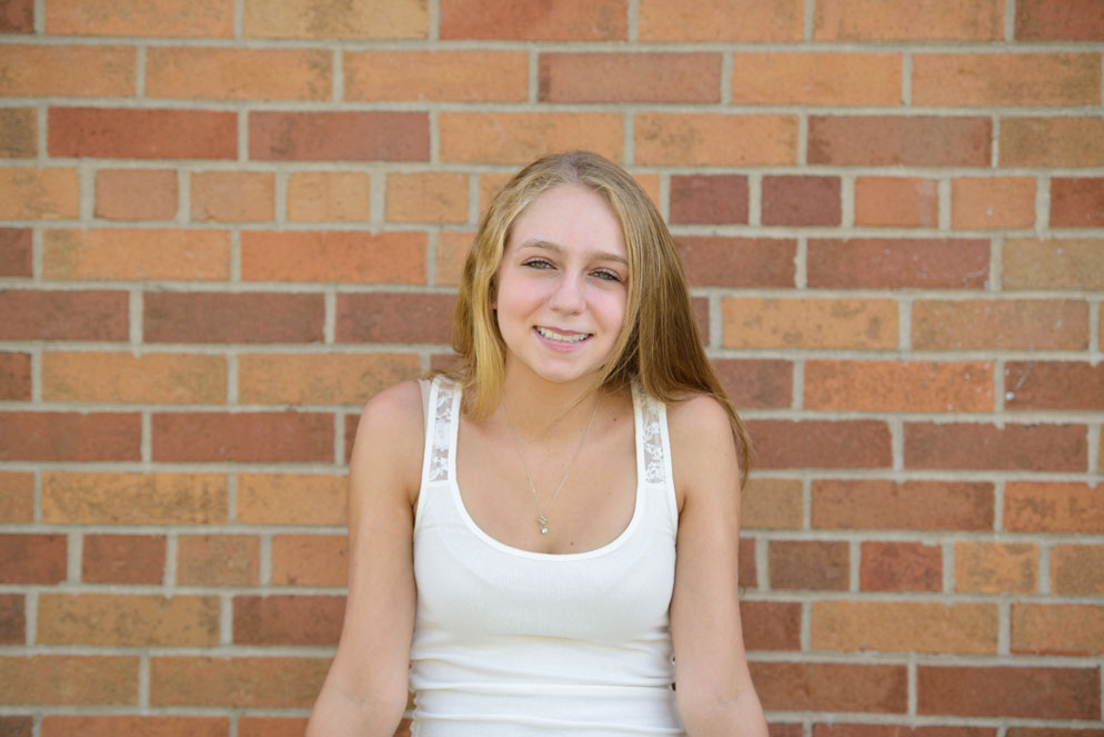
D800, AF-S NIKKOR 70-200mm f/2.8G ED VR II lens, 1/250 sec., f/2.8, ISO 100, Aperture Priority, Matrix metering, built-in pop-up fill flash.
The composition of this portrait is not interesting at all. The subject is sitting against a brick wall, centered in the frame, with a lot of extra space around her that doesn't add to the image.
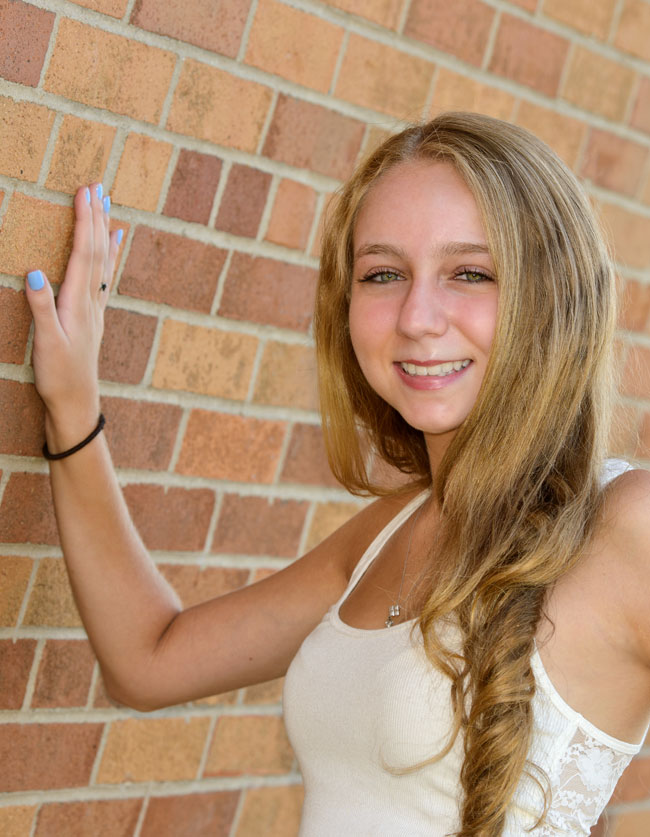
D800, AF-S NIKKOR 70-200mm f/2.8G ED VR II lens, 1/125 sec., f/5, ISO 100, Aperture Priority, Matrix metering, built-in pop-up fill flash.
In this shot, we've asked our subject to lean against the wall, and turn back to face the camera. We've also tightly cropped the image, as a vertical, for a more interesting look. The brick background now becomes more of a dynamic element in the composition.
D300, AF-S NIKKOR 24-85mm f/2.8-4D IF lens, 1/30 sec., f/3.5, ISO 200, Aperture Priority, Matrix metering, flash from the built-in pop-up on the camera.
In this image, not only is our subject wearing a pattered shirt, but he’s sitting next to a shelf that’s cluttered with a variety of items (on the left) while vertical blinds rest against his opposite shoulder.
D300, AF-S NIKKOR 24-85mm f/2.8-4D IF lens, 1/30 sec., f/3.8, ISO 200, Aperture Priority, Matrix metering, SB-900 bounced off ceiling with a reflector throwing light onto the subject.
In this image, we’ve asked our subject to move over—so the vertical blinds become the background. In addition to changing into a solid color shirt, by zooming in for a tighter crop, we’ve gotten rid of all of the distractions. Light bounced off the ceiling provides soft illumination for the image.
Finally, unless you shoot mug shots for the local police department, don't photograph your subject head-on. Have him turn his body a little, maybe 45 degrees away from you, and then rotate his head back to face you. (Tell him, "Don't move your shoulders, just turn your head to me.") It's a nicer, more flattering pose and helps slim people down.
D800, AF-S NIKKOR 24-120mm f/4G ED VR lens, 1/60 sec., f/4, ISO 400, Aperture Priority, Matrix metering, SB-900 Speedlight, direct flash.
In this photo, we’ve got a couple of problems. First, with direct flash on the subject, there’s a harsh shadow hitting the background. Secondly, the background is a little cluttered, with portions of picture frames on the sides, the ceiling visible at the top and a couch near the bottom of the frame. Lastly, the straight-on pose is not flattering.
D800, AF-S NIKKOR 24-120mm f/4G ED VR lens, 1/60 sec., f/4, ISO 400, Aperture Priority, Matrix metering, SB-900 Speedlight, bounce flash.
We’ve created a nice image by zooming into the frame, to isolate the subject. The background is not a distraction anymore. By bouncing the flash off of the ceiling, the lighting is soft, without harsh shadows that detract from the image. Lastly, instead of having the subject stand perpendicular to the camera, we’ve had him stand on an angle, with his head turned back to the camera and arms crossed.

